Smart Interfaces. Seamless Experiences.
A collection of product design work across mobile and web crafted to be intuitive, scalable, and built with users at the center.
TeamBuildr
Body Heat Map - Web & Mobile
Overview
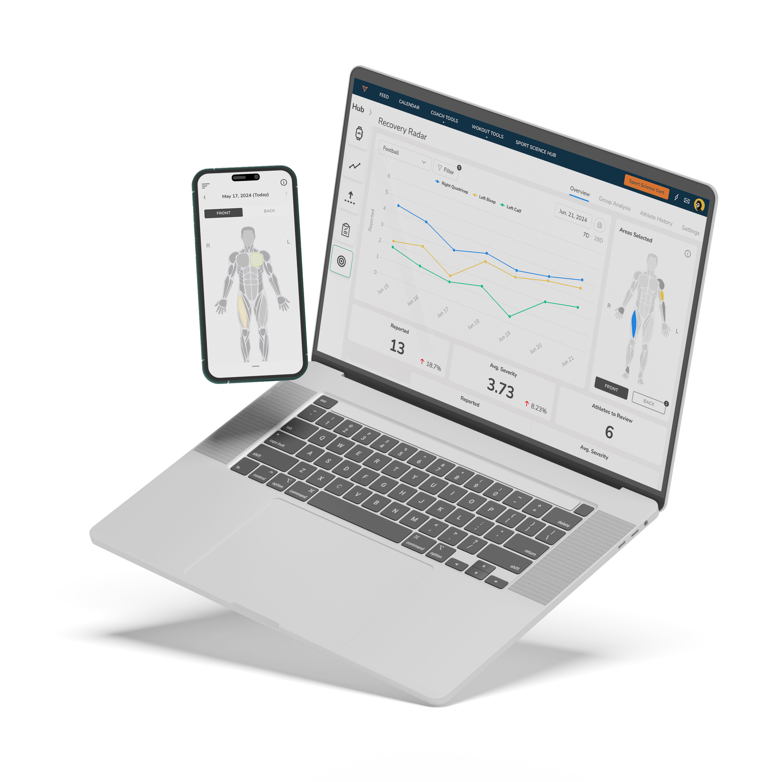
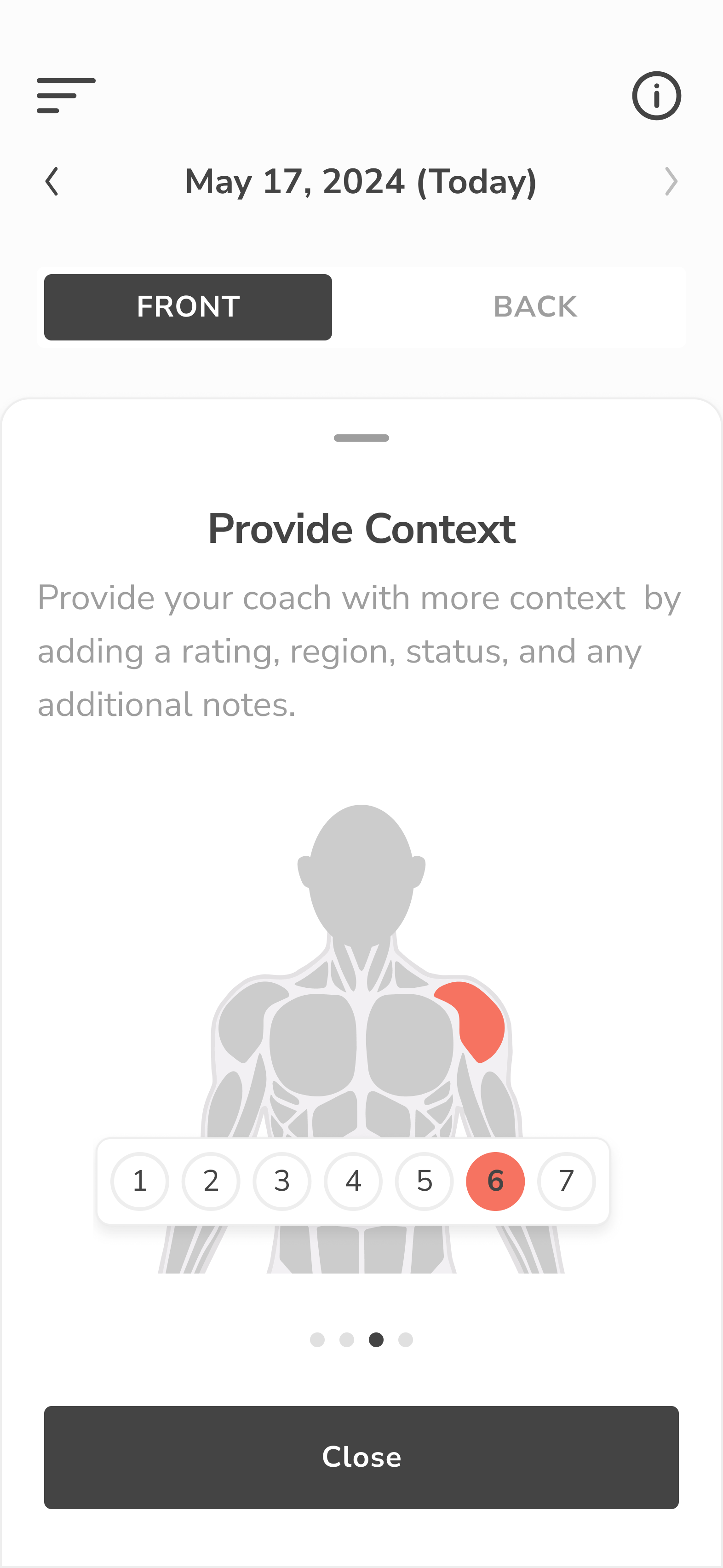
The Body Heat Map was designed to give coaches and sports scientists real-time, visual insight into athlete soreness, injury, and recovery trends across teams. Available on both web and mobile, this feature turns subjective feedback into actionable data, mapped directly to the human body.
challenge
TeamBuildr needed a way to help coaches visualize athlete-reported pain or soreness more effectively than raw data tables or generic forms. Key challenges included:
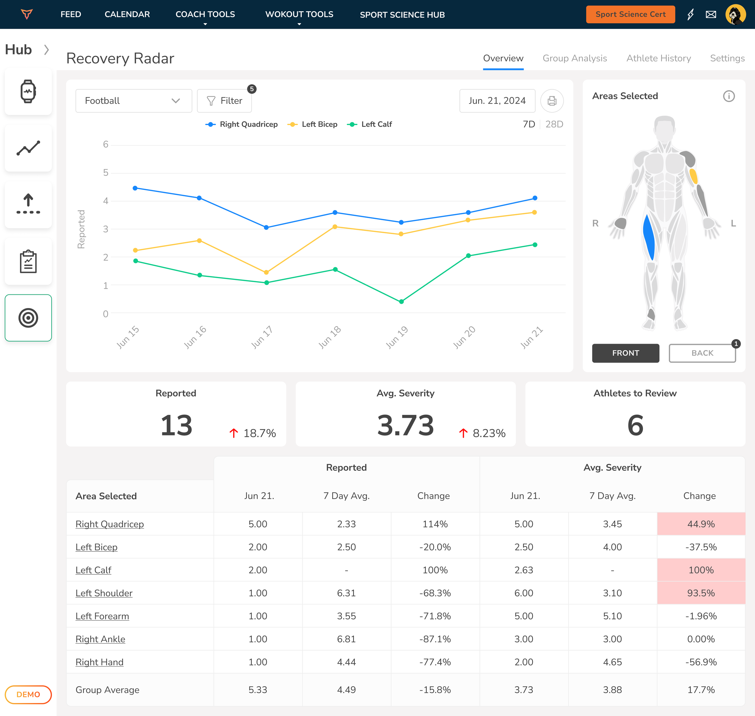
Making complex recovery data visually digestible at a glance
Creating a scalable system that works across individual, group, and historical views
Designing an interactive experience that was clear on both mobile and desktop
Mapping data accurately to the human body in a way that was intuitive, not clinical
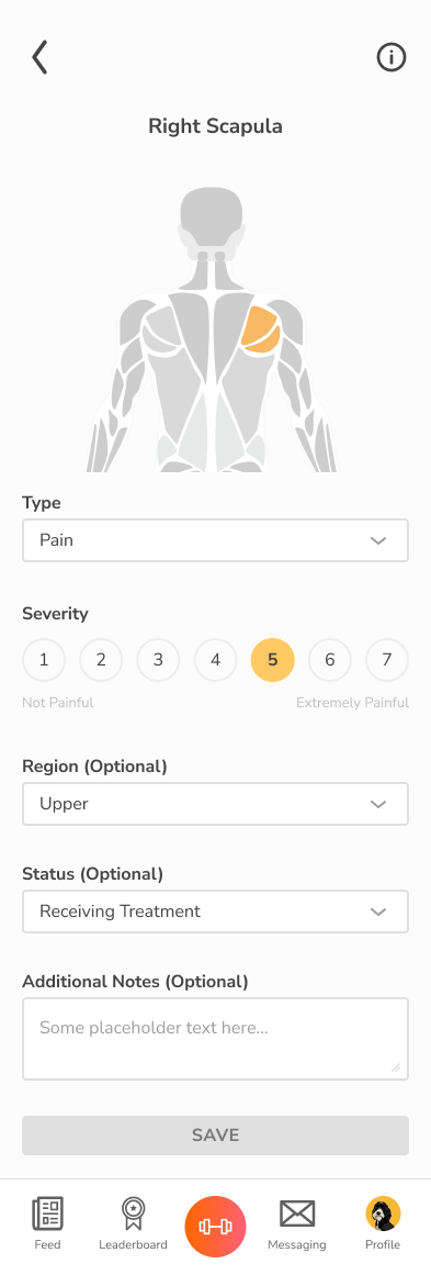
The goal was to make the experience fast for athletes to log, and clear for coaches to interpret without overcomplicating the UX.

outcome
The Body Heat Map feature has become a core piece of the TeamBuildr product suite. It empowers coaches to catch trends, reduce injuries, and tailor recovery programs faster than ever. Adoption rates soared among teams, and qualitative feedback from coaches praised the speed, clarity, and actionable utility of the new tool. Athletes, meanwhile, found it fast and frictionless to log their soreness, ensuring coaches get the data they need, when they need it.

solution
We built a multi-layered product experience around the Body Heat Map that combined usability, clarity, and data richness:
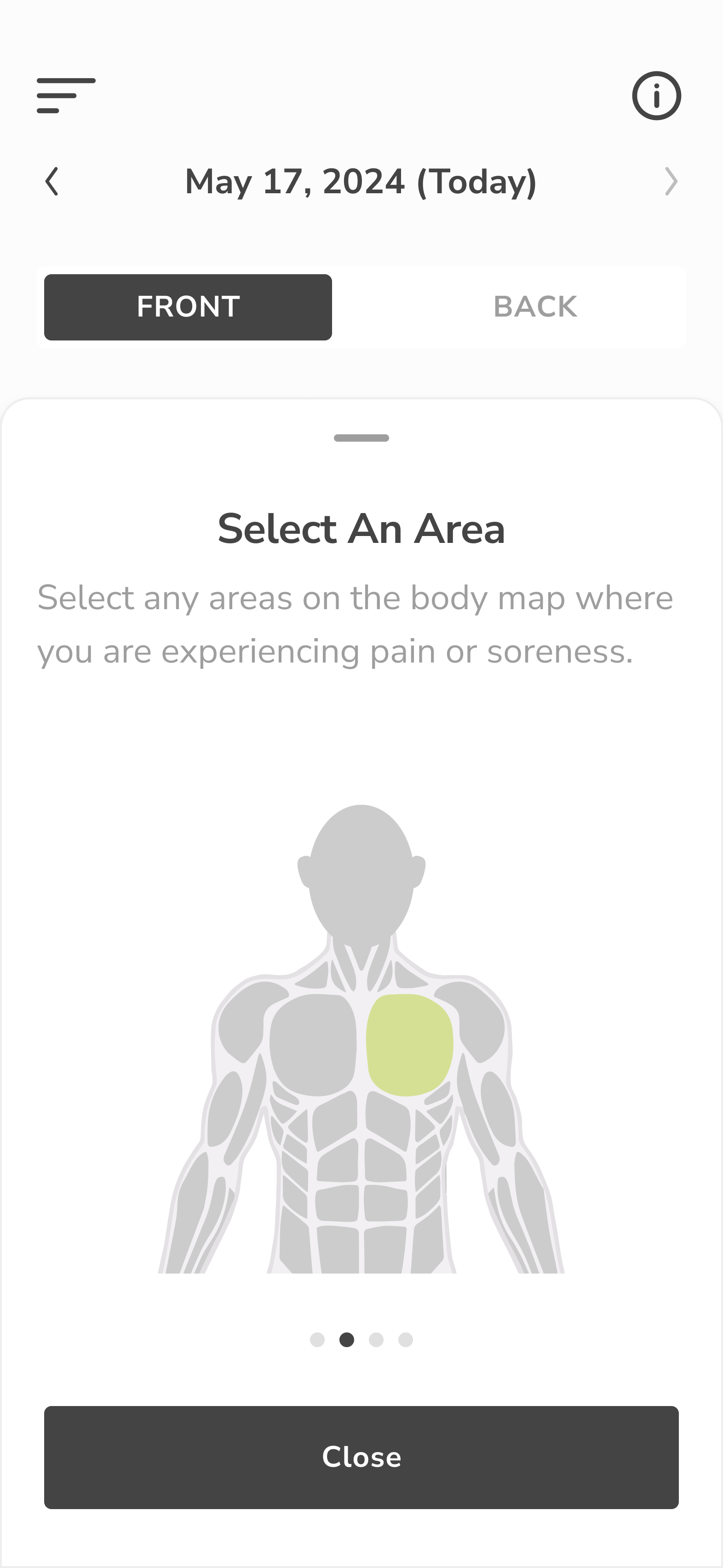
Interactive anatomical model with front/back toggles and region-based reporting (e.g., left quad, right scapula)
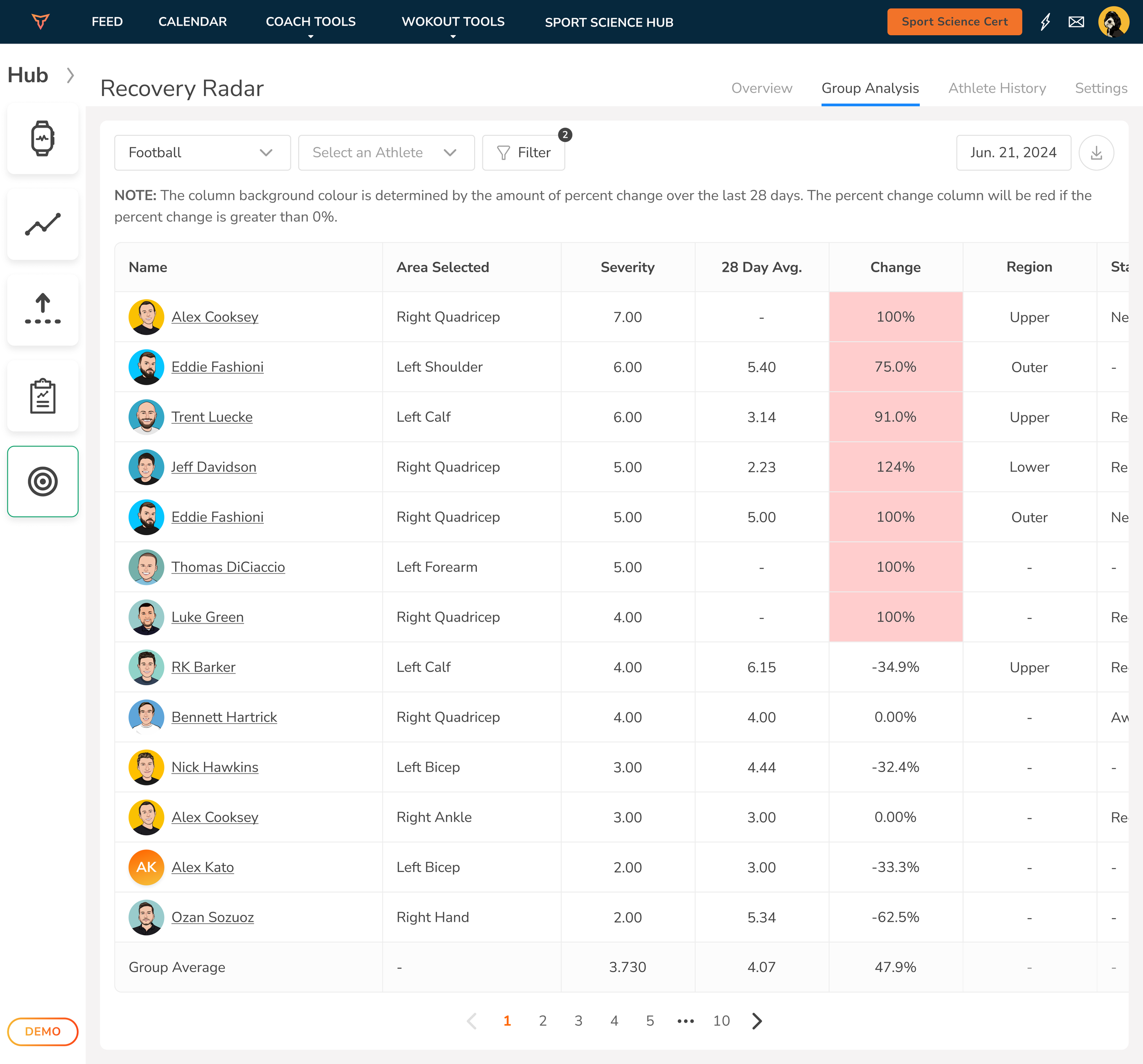
Severity scale and pain type selector with clean, thumb-friendly UI for mobile and a detailed table-view for web
Color-coded heat mapping showing intensity of pain or injury across time, from individual to group levels
Views for Overview, Athlete History, and Group Analysis allowing coaches to compare changes over time and act early
Web + mobile parity in functionality, with gesture-friendly input on phones and rich data tables for deeper analysis on desktop
We leveraged clean visual hierarchy, consistent color systems, and simplified navigation to reduce friction—especially for users logging daily entries.
challenge
Many GymStudio clients, especially smaller gyms and boutique studios, lacked a simple, modern way to track class check-ins. Front desk staff were either manually logging attendees or relying on disconnected systems. We needed to create a product that:
Worked seamlessly with the existing GymStudio class scheduling backend
Was intuitive enough for members to use on their own
Scaled across different setups (front desk iPads, desktop kiosks, etc.)
Handled edge cases (like no scheduled classes or unregistered users) gracefully
The goal: reduce admin burden and improve member experience at check-in, without adding friction.
outcome
Studios that adopted the Kiosk Check-In saw immediate improvements in operational flow. Staff no longer had to manually track attendance, and members appreciated the autonomy of checking in without a bottleneck. Usage rates remained high thanks to the frictionless design, and class data accuracy improved across the board. The feature gave GymStudio a competitive edge, offering a premium-level check-in experience to facilities of any size.
GymStudio
Kiosk Mode - Web & Mobile
overview
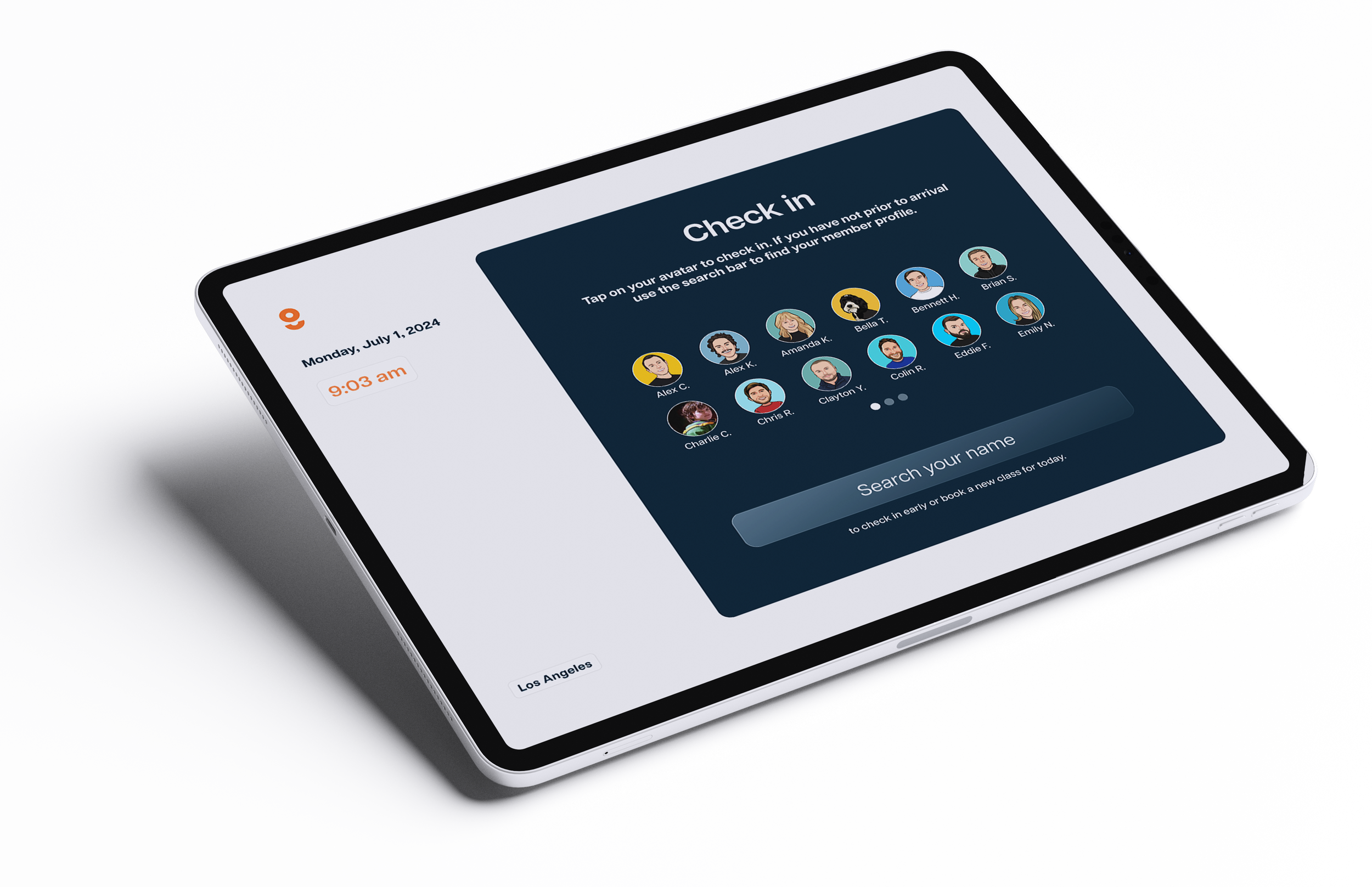
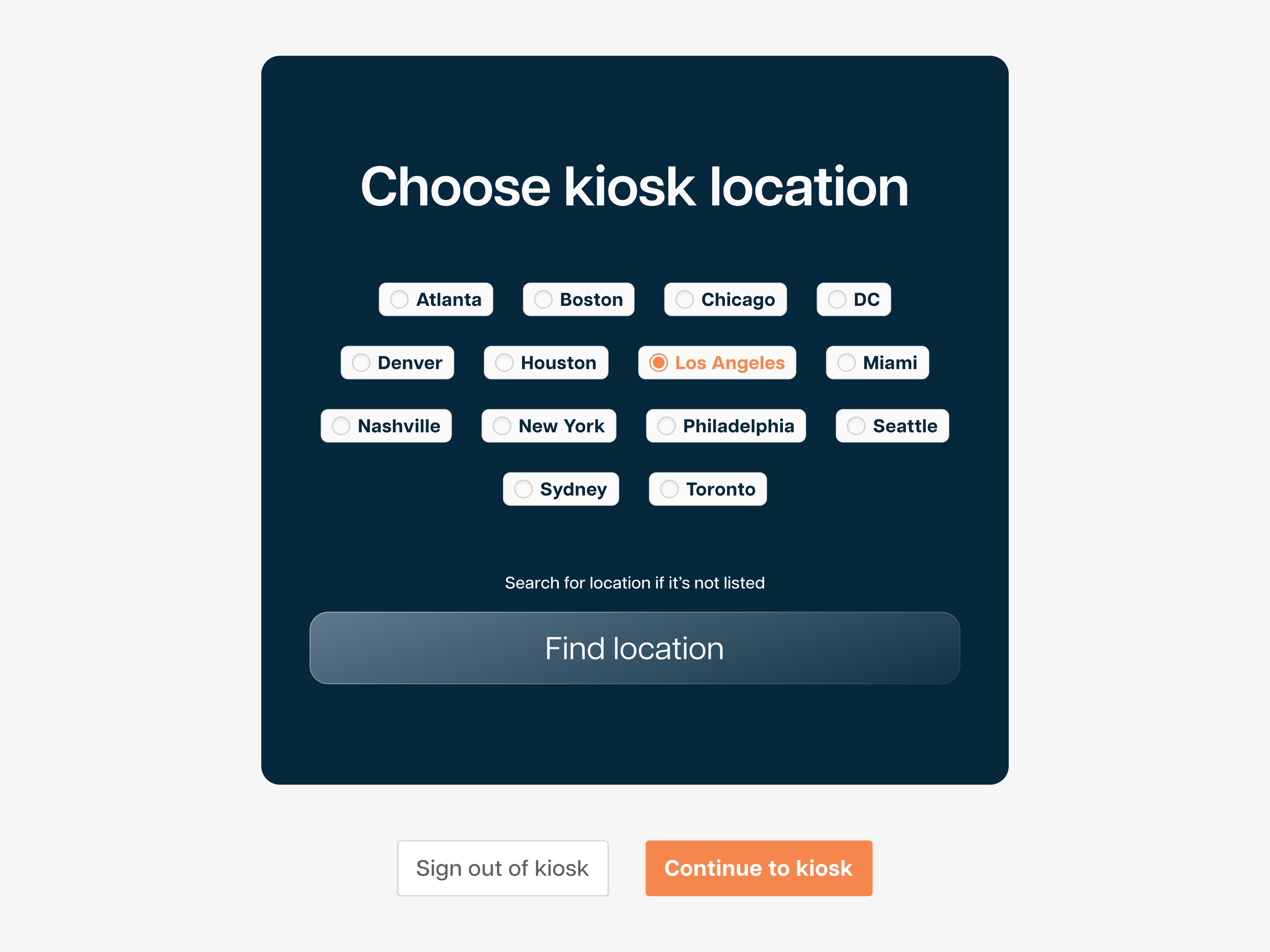
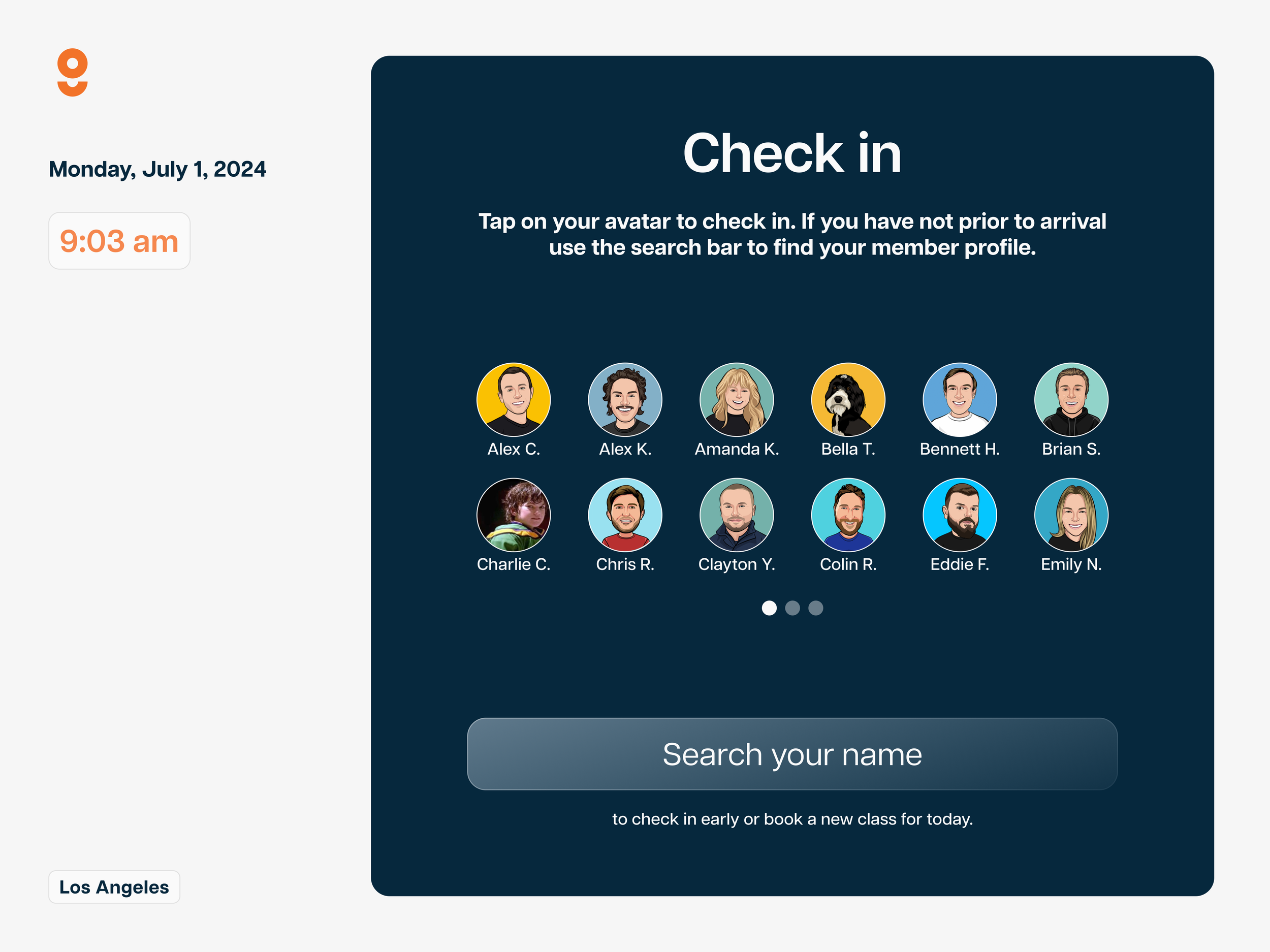
The Kiosk Check-In feature was built to help gyms and fitness studios streamline class attendance. No more clipboards, awkward front-desk bottlenecks, or missed check-ins. This fully integrated tool connects directly to the GymStudio class schedule, giving members an easy, self-serve way to check in, and giving staff a clear picture of who showed up and when.
solution
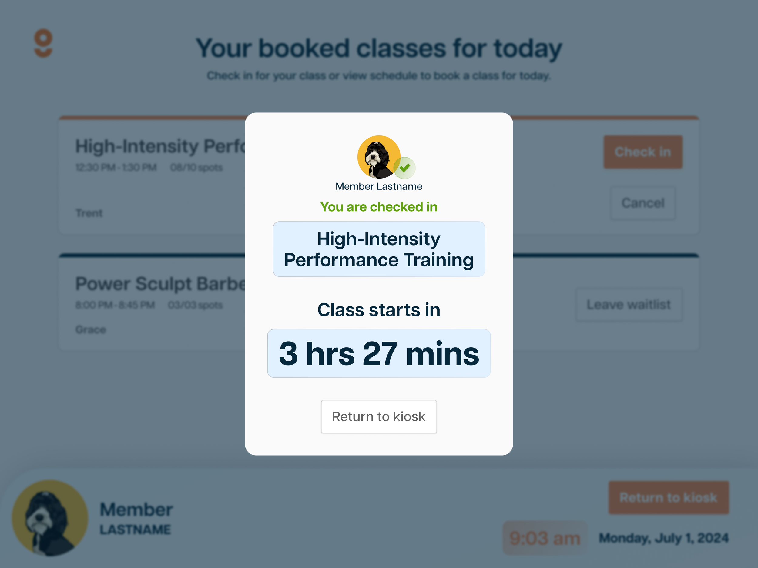
We designed a responsive, touch-friendly kiosk experience with simplicity at its core:
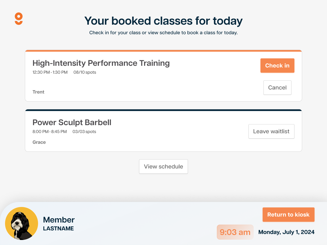
Personalized avatar check-in screen, allowing members to tap their profile and view booked classes
Real-time class syncing from the GymStudio scheduling system, including waitlist status, open spots, and instructor info
Simple check-in and cancel actions, built for speed and clarity
Fallback search UI for members not listed visually, with helpful error messaging
Empty state views to handle common issues like “no classes today” or “not found,” keeping the experience helpful and friendly
Customizable for facilities, with clean, branded UI and modular layout for kiosk or desktop display
Everything was optimized for quick user flow: walk in, tap your name, and you’re checked in, no staff needed.


Overview
Horizon Realty Group needed a modern, mobile-first experience to match how users actually search for homes today: quickly, visually, and on the go. We designed a mobile app experience that makes home discovery seamless, intuitive, and visually engaging—turning a complex buying process into something simple, personal, and efficient.
Horizon Realty Group


solutions
We approached the redesign with a focus on clarity, touch-optimized controls, and visual elegance. The product design work included:
Streamlined onboarding with a warm, branded welcome screen
Clean card-based property listings with instant info, photo carousels, and price highlights
Advanced filtering system with tap-friendly toggles for beds, baths, price range, and amenities
Interactive map view for geo-based property discovery
Detailed listing pages showcasing property features, descriptions, and calls to action like “Start Chat”
The design language follows Horizon’s brand with clean typography, generous white space, and modern iconography—making the app feel upscale and approachable at once.

outcomes
The Horizon Realty mobile app now delivers a premium browsing experience aligned with today’s buyer behavior. Users are spending more time on listings, filtering with ease, and engaging faster with agents. The app positions Horizon as a forward-thinking real estate brand ready to serve the next generation of home buyers.

challenges
The biggest challenge was translating the full real estate browsing experience—filtering, comparing, viewing, and inquiring—into a format that felt natural and fast on mobile. The old interface was web-reliant and didn’t offer the polish or fluidity users expect in top-tier property apps. Key pain points included:
Cluttered UI with inconsistent navigation
Lack of mobile-optimized filtering and property browsing
Poor visual hierarchy and property photo presentation
No real-time location-based browsing experience
HealthPoint


Challenges
The previous HealthPoint system was bloated, unintuitive, and overwhelming to navigate. It buried critical information, lacked a consistent design language, and made even routine actions—like checking patient status or viewing appointments—frustrating. The challenges we tackled included:
Overcomplicated navigation and unclear section hierarchy
Disconnected scheduling tools and appointment views
No visual prioritization of urgent tasks or training reminders
Inconsistent interface patterns and outdated UI
solutions
We redesigned the HealthPoint web app with clarity, accessibility, and day-to-day efficiency at the core. Key design improvements included:
A personalized dashboard greeting each doctor by name, with clear alerts and high-priority tasks front and center
Streamlined sidebar navigation for instant access to core sections like Appointments, Analytics, and Help Center
An elegant appointment scheduler using a scrollable, timeline-based UI that shows availability and flow at a glance
Clear visual indicators for total patients, clearance status, and cases needing review—color-coded for quick comprehension
Consistent visual design using soft gradients, clean icons, and intuitive spacing to make the app feel modern, calming, and organized
outcomes
The new web app is faster to navigate, easier on the eyes, and more aligned with how healthcare professionals actually work. Doctors now complete common tasks more efficiently, stay on top of appointments with minimal friction, and receive timely nudges for training and follow-up actions. HealthPoint’s digital experience now reflects its mission: modern, compassionate, and patient-focused.
HealthPoint needed a robust yet approachable platform for medical professionals to manage appointments, patient data, and ongoing training. The goal was to create a sleek, modern dashboard experience that reduces cognitive load, highlights what matters most, and empowers doctors to focus on care—not clunky software.
